Christmas trees banned from dashboards, but not all the time !

Myriam Blanchet
Analyst


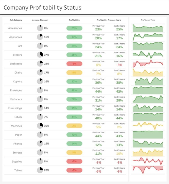
We discovered a post on LinkedIn discussing the use of red and green in charts. Despite the “no Christmas tree” rule being completely disregarded, the colors make the chart truly pleasing to the eye (ADNia wouldn’t argue that green isn’t a beautiful color)!
Here is the result presented in the publication:
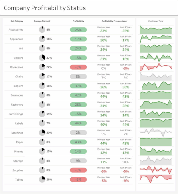
Among the comments, those of Nick Desbarats and Merijn Campsteyn are the most relevant. The use of yellow here is for neutrality, but in people’s subconscious, yellow is usually associated with caution and prudence, which is not the same as being neutral or equal. They therefore explain that the use of gray here would be more relevant to properly classify the elements of the table.
On the ADNIA side, we also suggest changing the text color to a readable gray on green and red (color #757575 in this case), so that the data stands out more.
So we arrive with the result below 👇
If we compare the before versus the after, this gives us this:
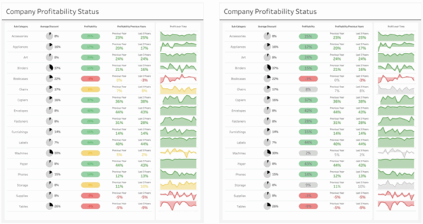
Readability is improved and the colors help to focus our attention on what is not going well, while promoting what is going well.
It is specified that these kinds of colors should only be used if we know that we do not have color blind people among our users (or change the colors to blue and orange in their case).
What do you think?